Dako Studio
I developed the brand identity for a small digital agency called Dako Studio based in Sabadell, Barcelona. They wanted it to be different but modern and up to date with digital trends and also to incorporate a Japanese touch.
Year
2022
Category
Visual Identity
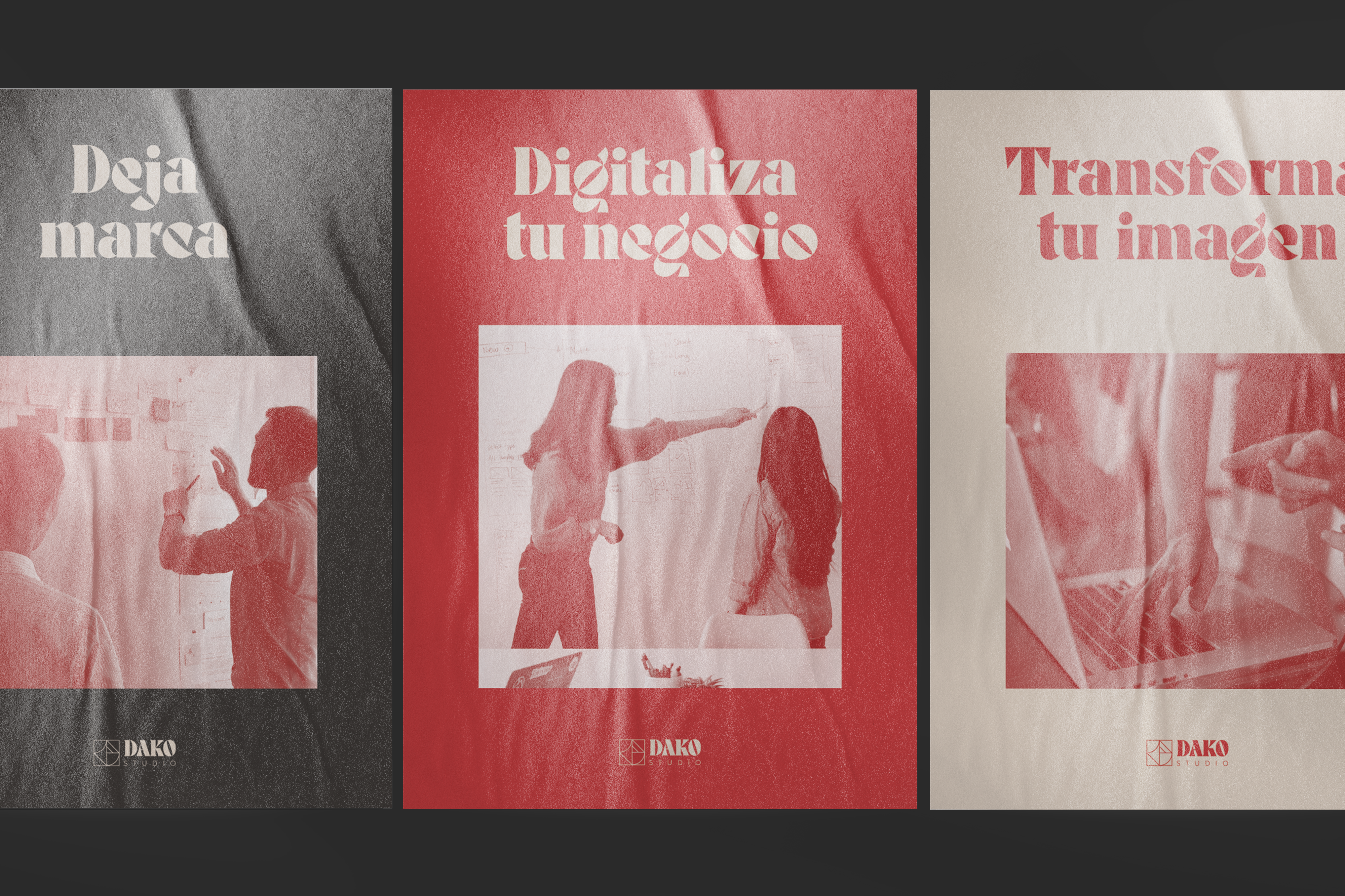
Print & Publication
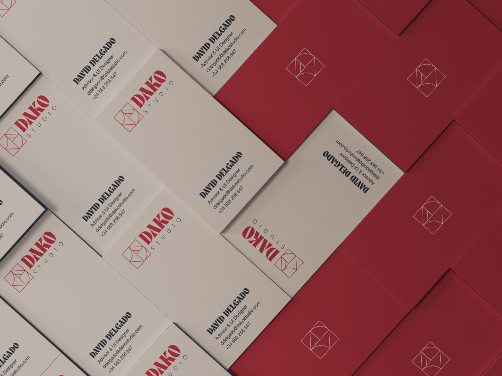
Logotype
The font used for the word «Dako» is the Miju Typeface, a font that is inspired by japanese culture. The font used for the word «studio» is Helvetica Neue. This combination of fonts represent the perfect blend between modern and trendy with a hint to japanese culture.
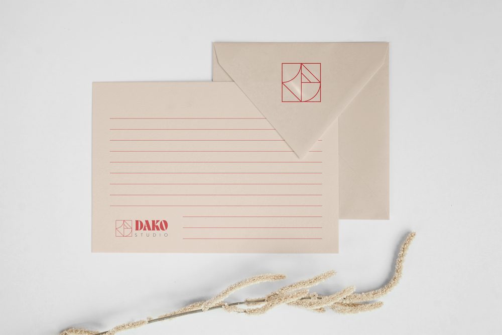
Isotype
The concept behind the isotype lies in the Japanese kanjis that represent the word Dako. I pulled apart the main shapes of these kanjis and rearranged and merged them in order to create Dako's isotype.
Brand Pattern
The brand's pattern consists of the infinite repetition of the brand's isotype. Together it creates a hypnotic yet beautiful mesh of shapes that resemble the crowds in japan.