
Polo'puesto
Polo’puesto is an ice-cream brand that I came up with for a master project. This project consisted in coming up with an ice-cream company name and concept and I later recycled the idea for another master project in which I had to come up with a brand identity and website design for a company. So, I ended up developing the naming, brand identity, communication strategy, labels, packaging and a UI design for desktop, tablet and phone for this ice-cream brand.
Year
2022
Visual Identity
Packaging
UI Design

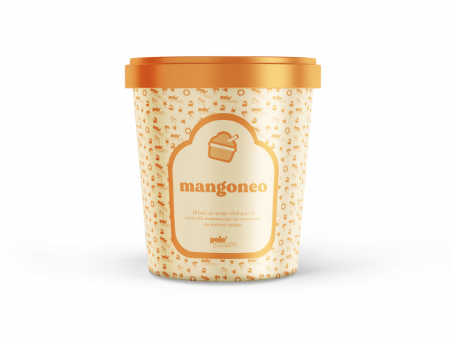

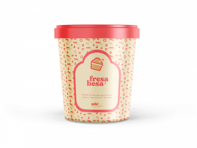

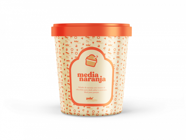

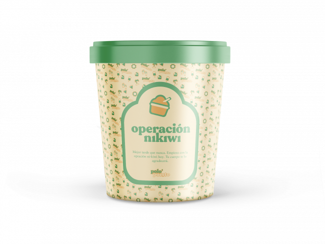


Naming and Tone
The name of the brand is a word play with «polo» which is a kind of ice-cream in Spanish and «polo opuesto» which means that usually «opposites attract». The tone of the brand is extremely warm and friendly towards the user and in occasions, funny. The names for the ice-creams are all fruit puns with different layers to them which are (1) to describe the flavour of the ice-cream, (2) to remind the consumer of summer and good times and (3) to make them laugh and make the ice-creams memorable.
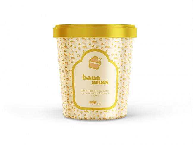
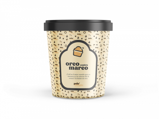
Some of the ice-cream names and meanings:
- Melonina _ It’s a melon ice-cream and plays with the word «melanina» in Spanish which is the skin component that makes you get tanned and the word «melon» itself.
- Operación Nikiwi _ This is the kiwi ice-cream with chocolate chips. «Operación Bikini» is what we call in Spain when we start a diet to look good for summer so this flavour plays with that expression and changes it to «operation not even kiwi».
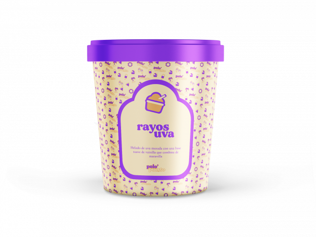
- Rayos UVA _ This is a grape (in Spanish: uva) flavoured ice-cream. It’s a word pun with UVI Rays that is Spanish is literally called «rayos uva» and the word «uva» itself.
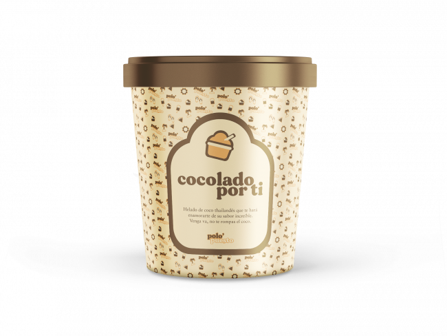
- Cocolado por ti _ This one is the coconut flavoured ice-cream and plays with the Spanish expression of being «colado por ti» which means to have a crush on someone.
Brand Pattern
The pattern designed for Polo’puesto are a series of summery icons that people can’t help but associate with the summer season. Icons like: a pair of flip flops, a palm tree with coconuts, a watermelon slice, the sun among others. This pattern also includes the brand logo and its colours adapt to each ice-cream flavour.


Website
I developed a prototype in Figma of how I envisioned the brand’s website to look like and adapted it to three different screen sizes to make it as responsive as possible (desktop, mobile and tablet).
The Polo’puesto prototype includes four different pages: a home page, a product list page with all the available flavours, a product detail page and the About Us page.


