Color. El conocimiento de lo invisible.
For this master project we were given a real life client (Fundación Telefónica – Espacio) for which we had to develop a website proposal for their new project, Color, and pitch it to them. In order to do so, we started the project by conducting a thorough research on their users, competitors and the actual market to properly develop the final prototype. After that, we narrowed down the scenarios that we wanted to present to the company for the final pitch and sketched them to conduct a first A/B testing among our target group. As the last step, we designed the final prototype on Figma which we then presented to the client.
Year
2022


The project
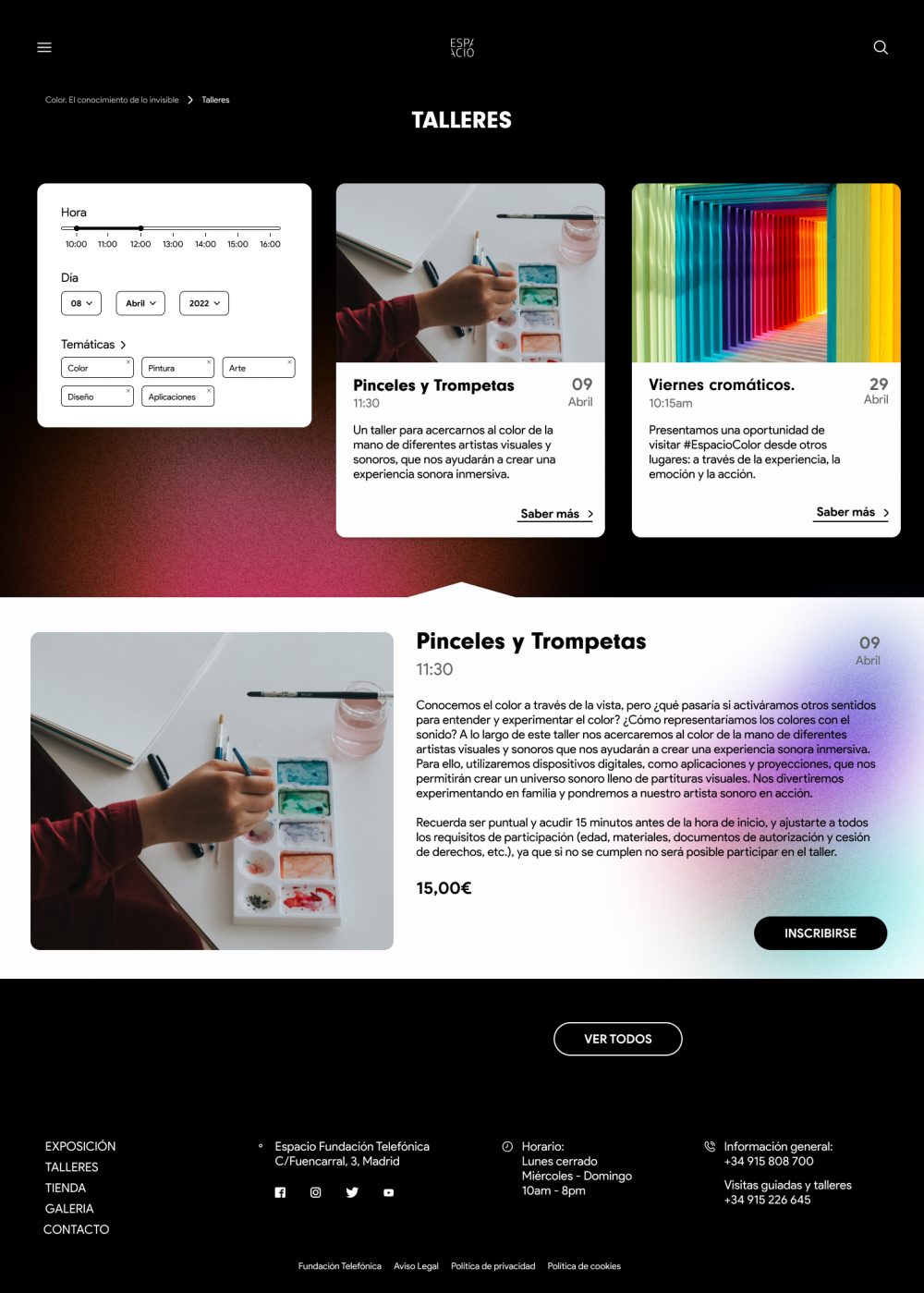
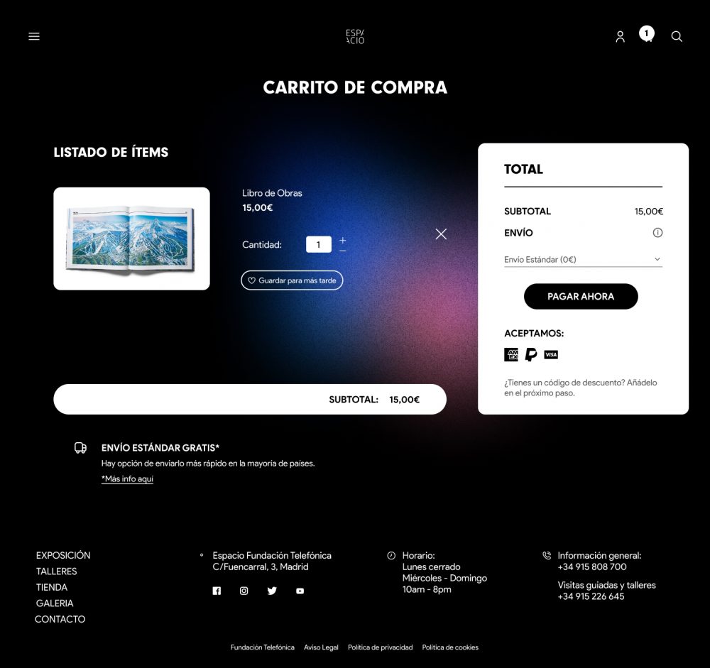
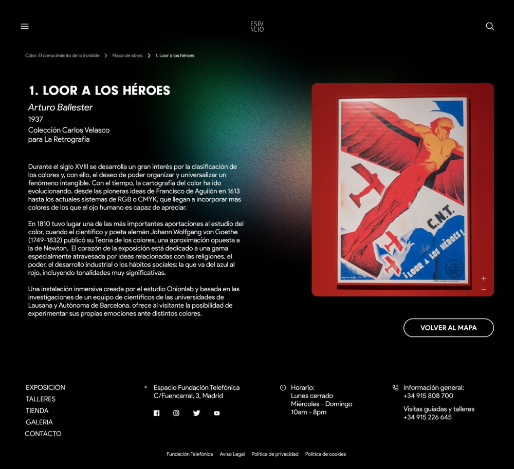
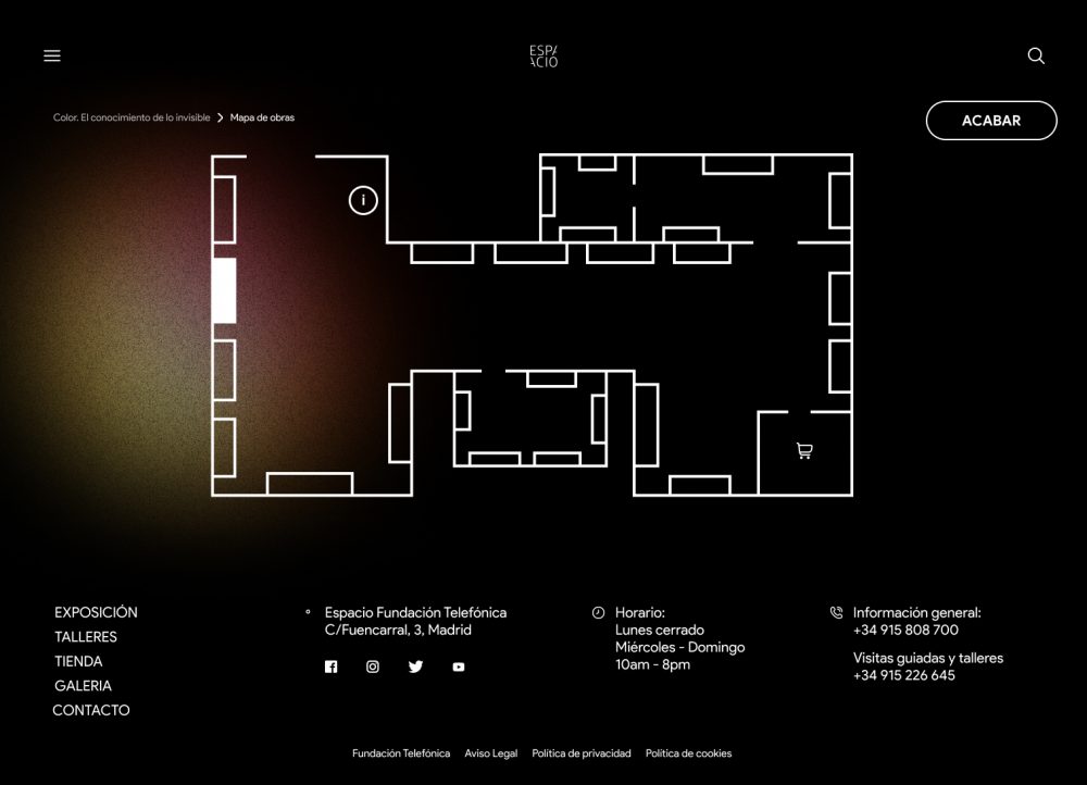
The project that we were asked to develop was a responsive website for an art exhibition that wanted to increase its reach by creating a virtual version of the physical exposition as a website were one could see and visit all the art pieces as if they were in the actual exhibition.


The process
We carried out this project in different fases which later on allowed us to develop the final prototype.
- Benchmarking: We looked into other solutions that are already out there whose aim was similar to our project’s and analysed their strengths and weaknesses.
- Content Audit: We organised the information available to us from «Color» to easily organise it later on.
- User Personas: After conducting several interviews, we were able to define their target groups and analyse their pain points, objectives, motivations, hobbies, media consumption habits, …
- Scenario definition & Journey Map: Once the target groups were clearly defined, we started looking into developing several scenarios in which we could see how they interact with the prototype and created a journey map for each scenario.
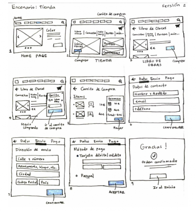
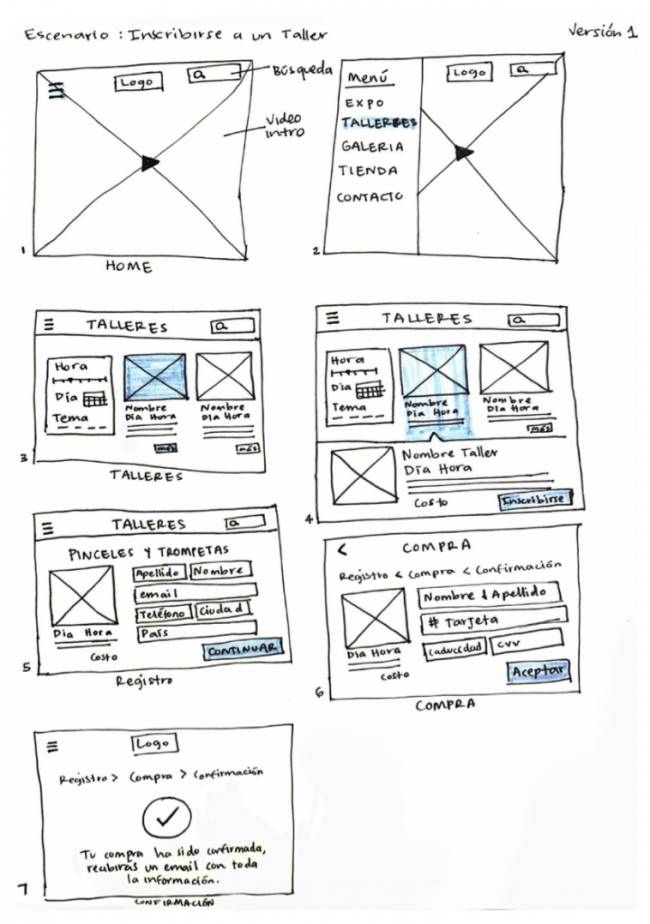
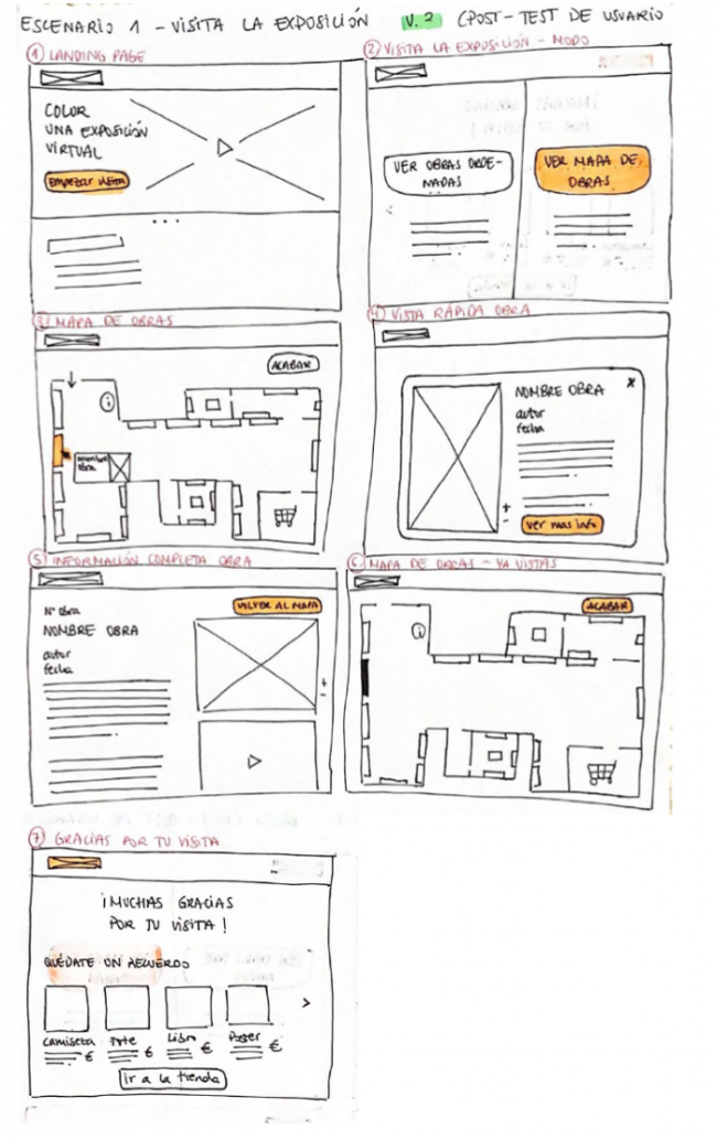
- Sketching: After the scenario definition, we sketched out two versions of each one to explore different ways in which we could organise the information on the screens.
- Wireframes: In order to see the website’s structure and the information organisation we designed the wireframes from the previously drawn sketches to conduct some A/B testing on users from our target groups.
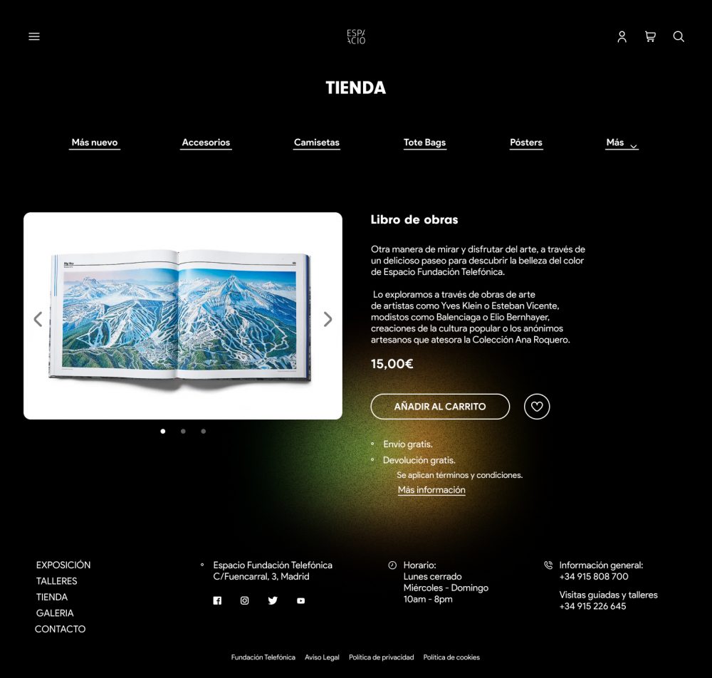
- Prototyping: After the testing, we made some changes based on the comments that we got from the interviews and developed the final prototype to present to the client. The prototype allowed the user to interact with the three scenarios that we defined in the previous steps.
Sketches