L'Estacional – Craft Beer
This is my Master Thesis project. I came up with the concept for a craft beer company and develop its brand identity accordingly. I defined the brand’s personality, purpose, values, tone, target group, … and then, taking all of this into consideration, I designed its identity. Aside from the identity itself I also developed some brand applications in which you can see the different parts of the identity coming together.
Year
2022
Visual Identity
Naming
Illustration
Typography
Packaging

The concept
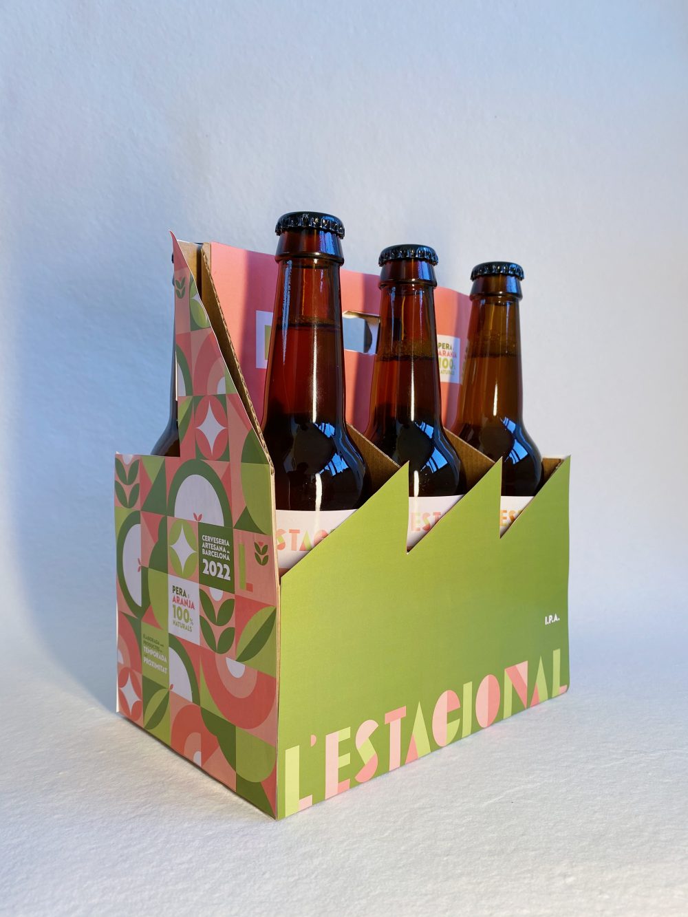
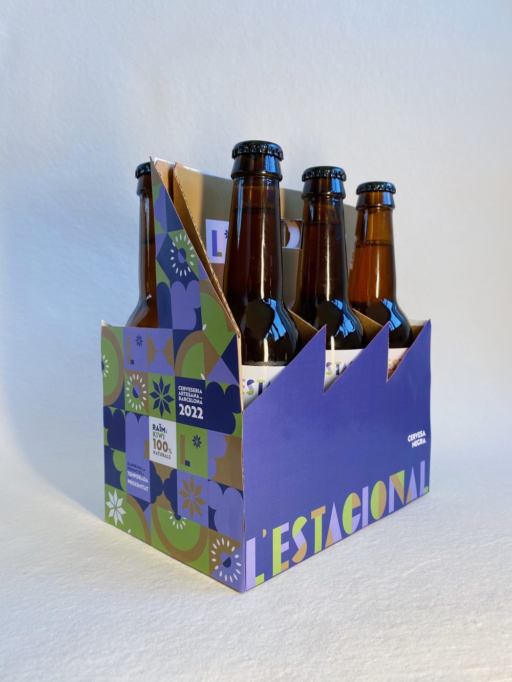
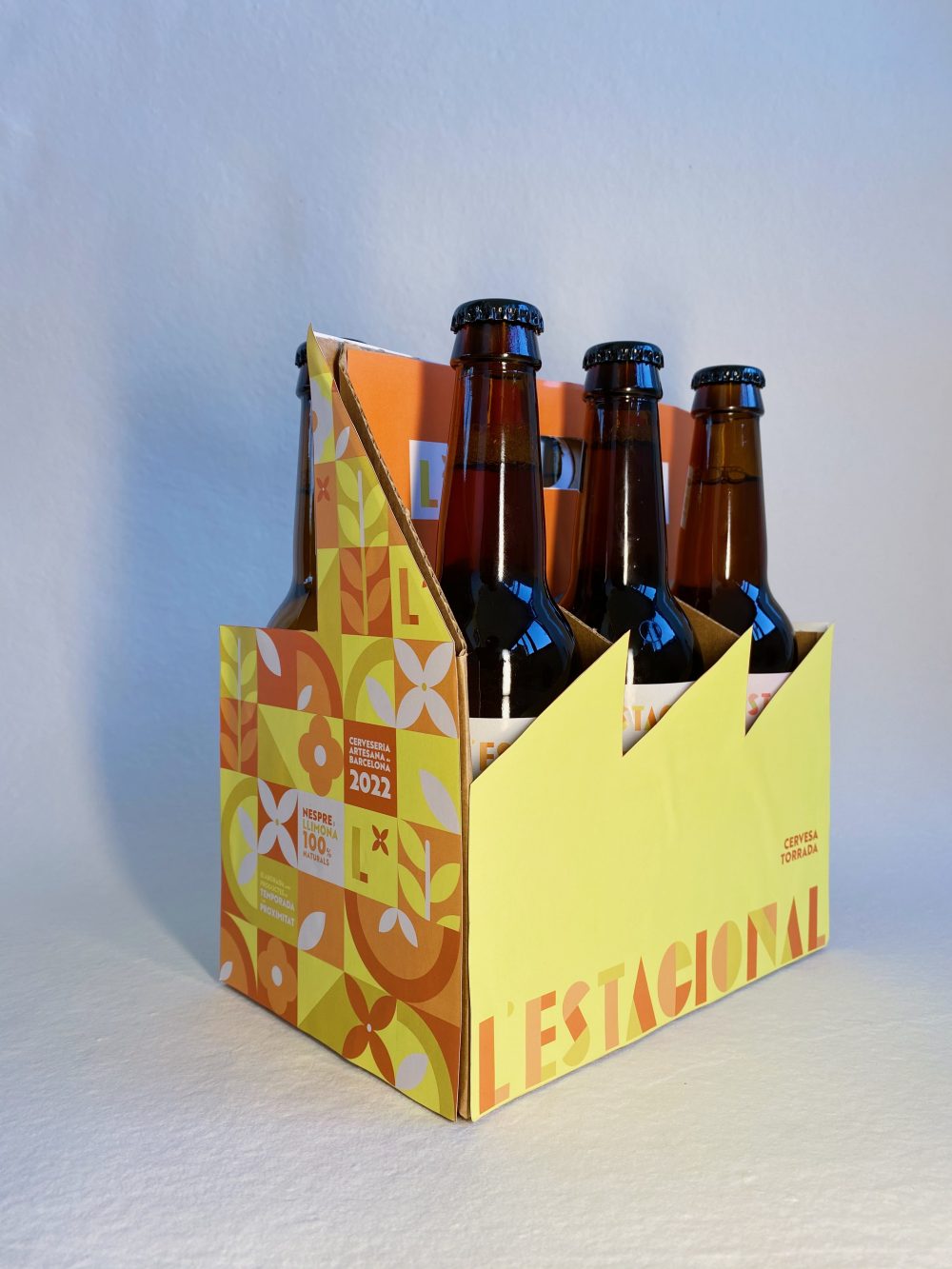
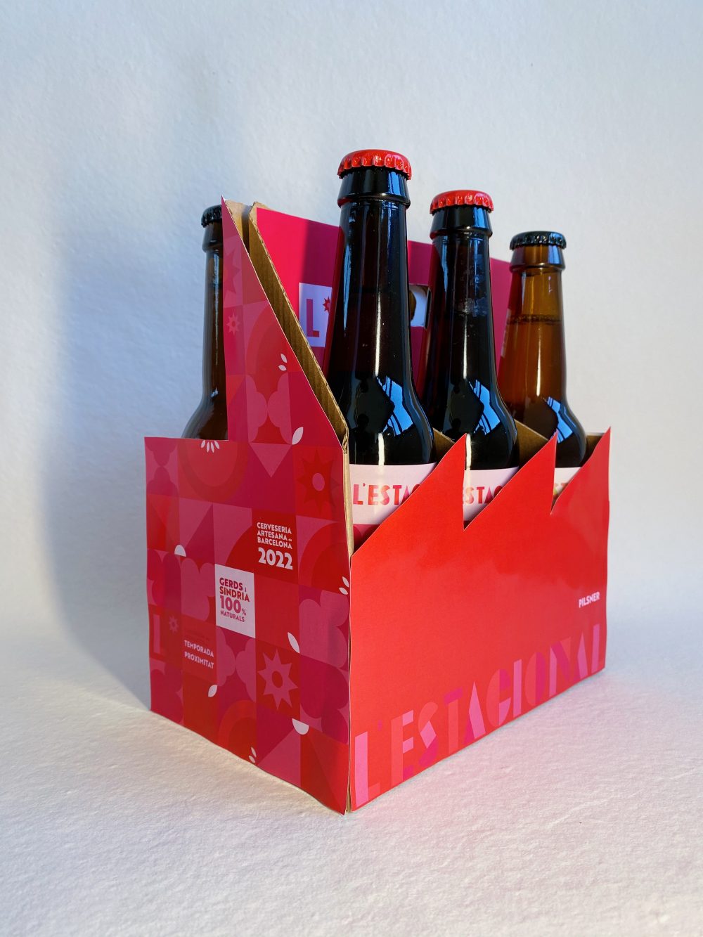
The brand has the Catalan name («L’Estacional») as the beer brand is based in Barcelona and it would translate as «The Seasonal» in English. The name arises from the brand’s concept, which is basically that they brew a different beer for every season of the year. So, they have a total of four beer recipes that go with the four seasons we have in a year: Summer, Autumn, Winter and Spring. For each one of them, they grab a traditional beer recipe (Lager, IPA, Black Beer, …) and introduce a twist to it by inserting seasonal fruits into them.

Purpose
The reason why there are only four recipes is because the brand’s purpose is to reduce food loss and waste by using seasonal products from Catalunya. It is said that a third of the produced food across the globe is thrown out before it even gets to the plate so L’estacional’s purpose is to contribute in making that number smaller. It also relies on nearby goods to reduce the impact transportation has on the environment and the use of unsellable fruits due to their image in their recipes.
Brand’s Personality
I wanted the brand to be youthful as the target and the communication strategy would go accordingly. It is also a socially and environmentally conscious brand as its purpose is to make their consumers aware of the importance of healthy consumption habits and how this has an impact on the environment. For this reason, I imagined the brand being straightforward with their message to their consumers but without losing the message of optimism which is: «with everyone’s collaboration, we can make the world a better place».
Brand Identity

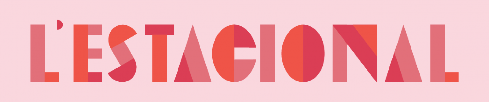
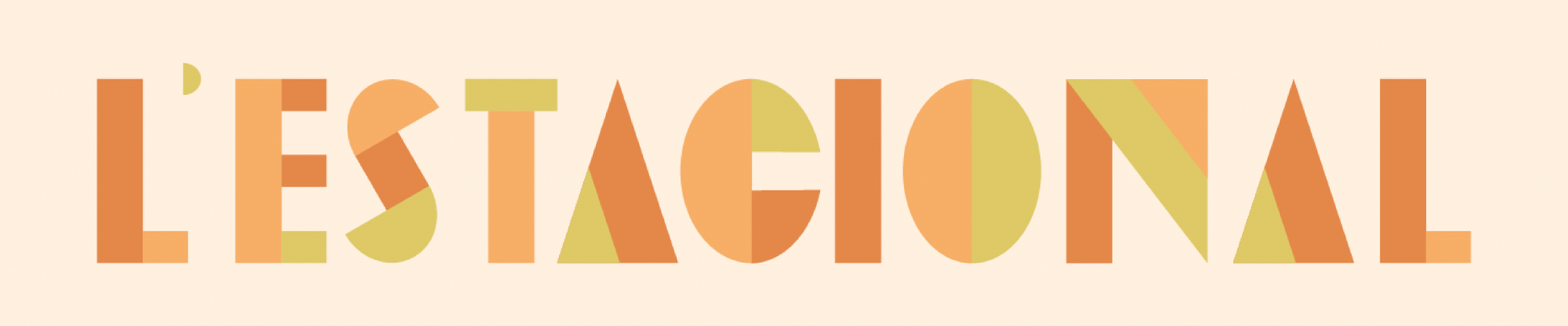
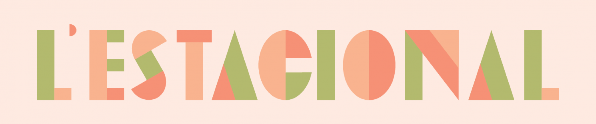
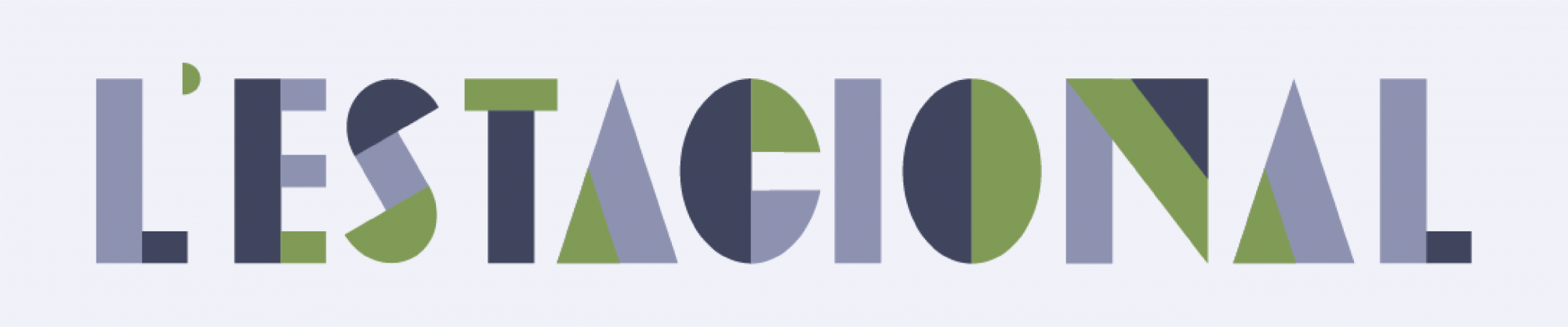
Typography
I had to try to find a geometric typeface that worked with the overall concept of the brand and its image but I couldn’t find one. For this reason, I designed a custom display typeface that fit called «Estacional». However, the chosen type for large body texts was «Brother 1814» in both Black and Regular.
Illustration
I wanted to make the visual language easily recognisable, replicable and adaptable to different formats. For this reason, I came up with a visual language that was made of geometric illustrations (2:2) that allowed me to do so. Each of the squares from the illustration work on their own and as a combination with one another. This also wants to represent the importance of individuality in a group in the fight against climate change, because individual actions, when put together with many others, they do have an impact.

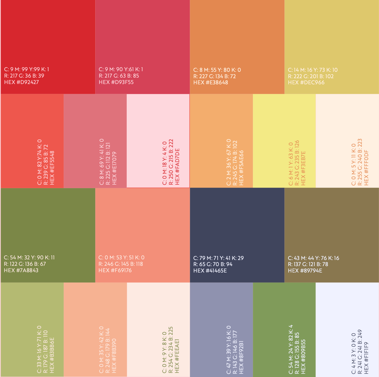
Color Palette
Given the fact that there were four different type of beers inside the brand’s portfolio, I had to find cohesion in the heterogeneity and that was achieved through the chosen illustration style and the custom type. However, I needed to clearly differentiate the different recipes from one another, so I chose different color palettes for each season.
Logotype


Isotype


Labels

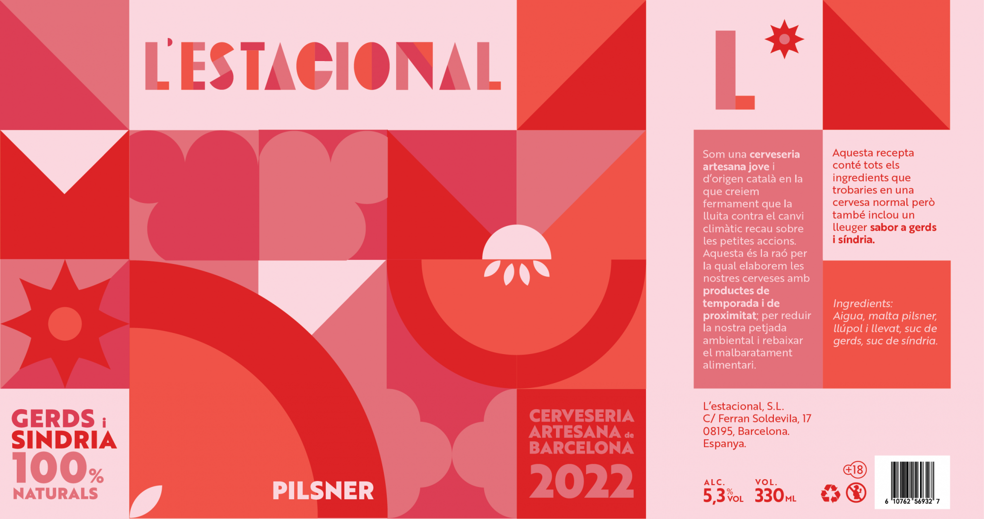

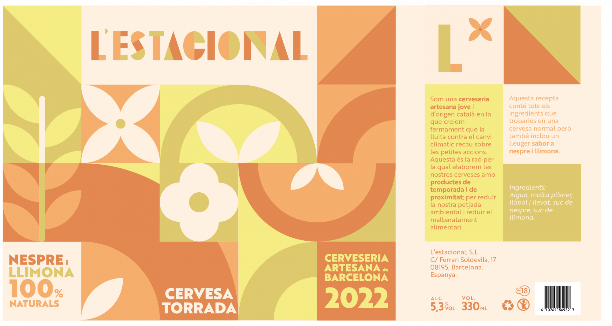

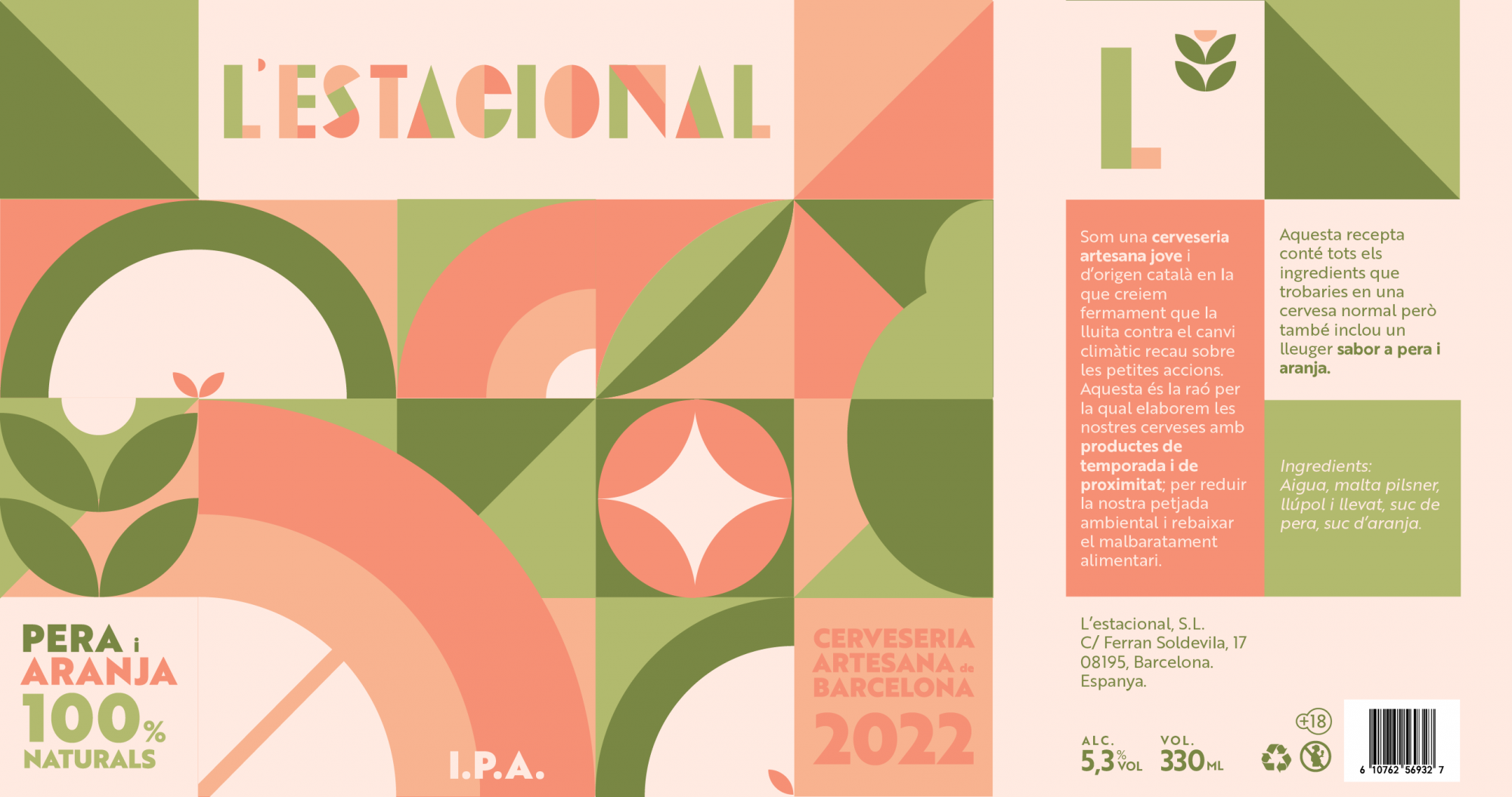

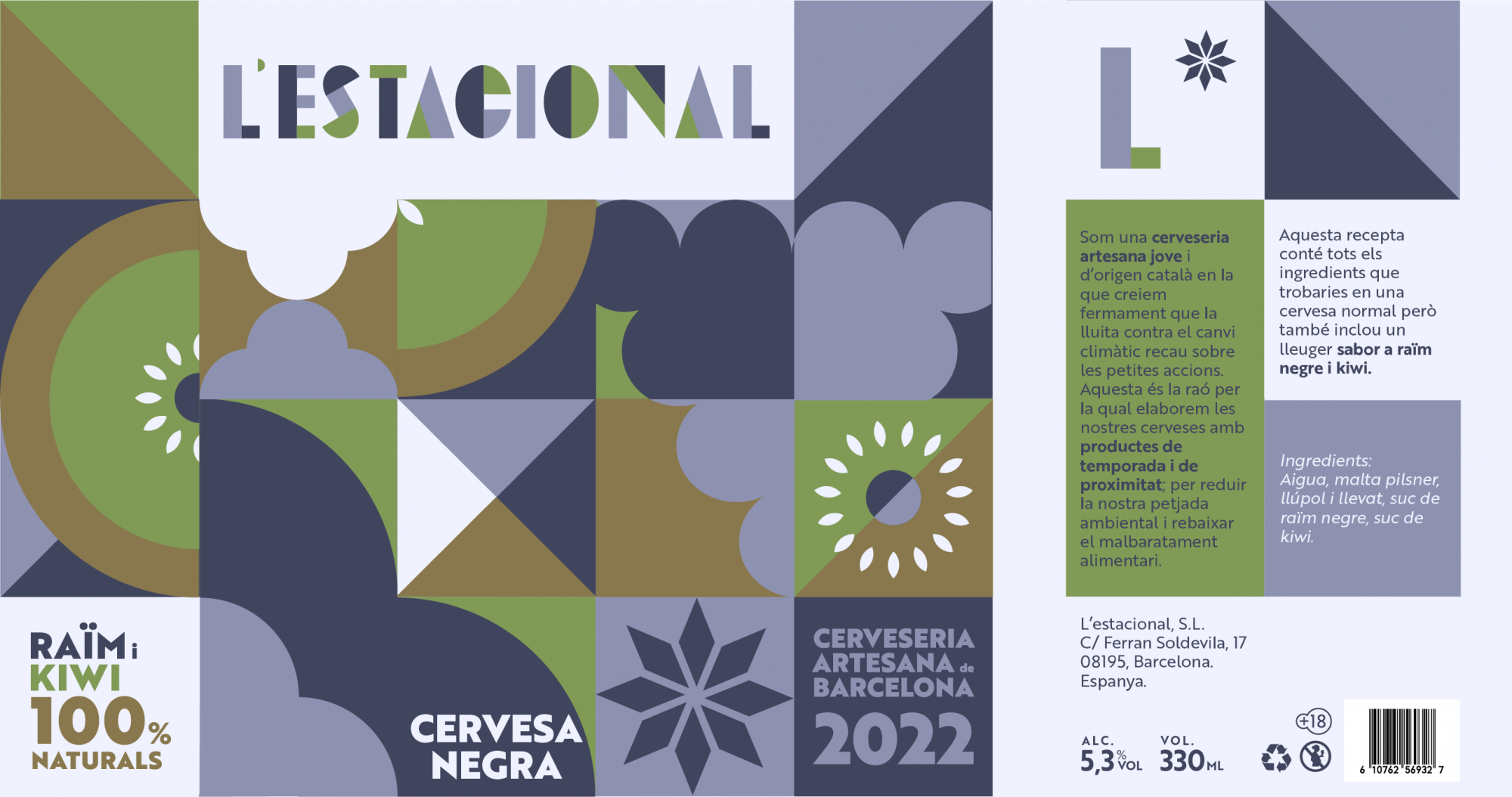
Packaging